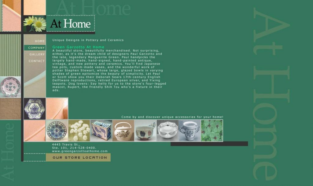
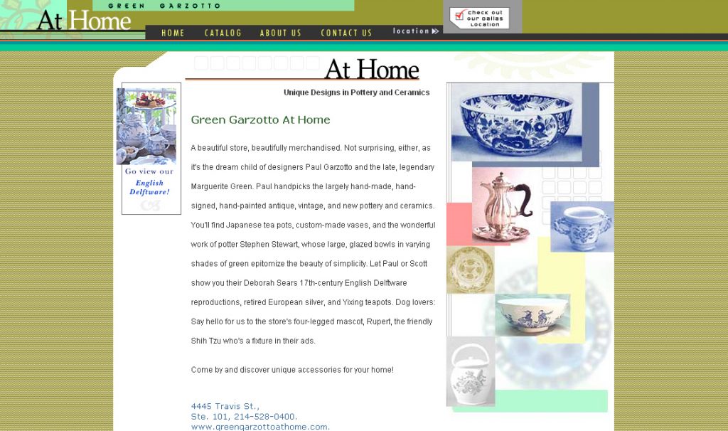
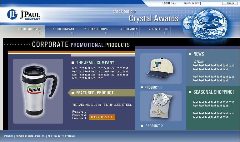
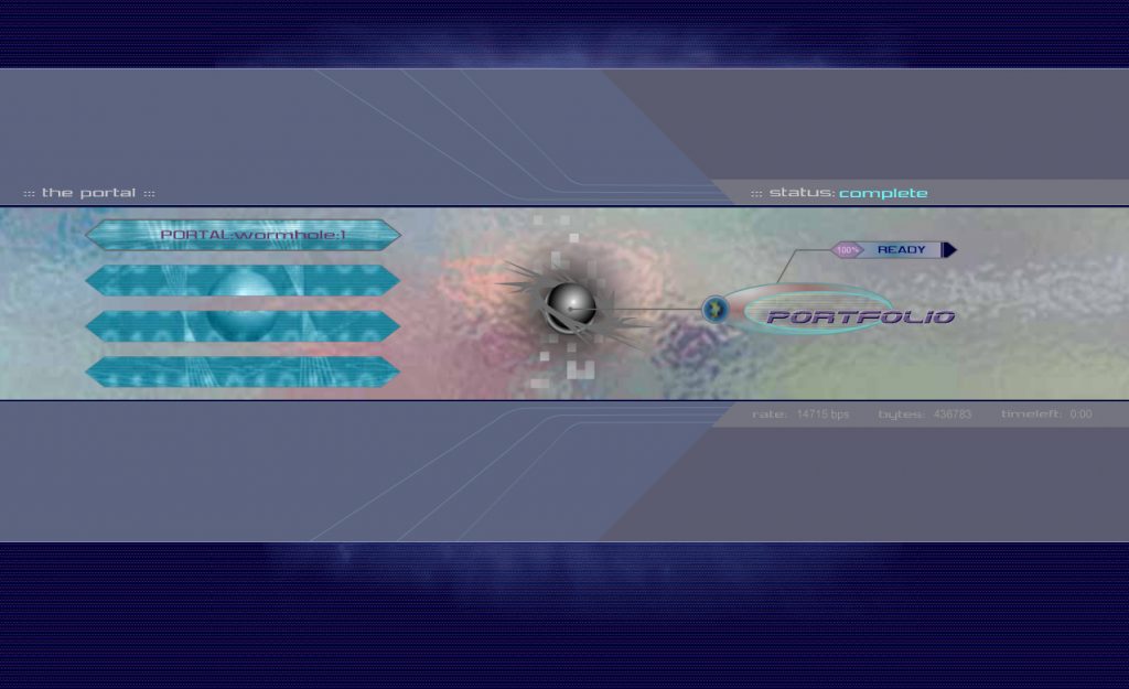
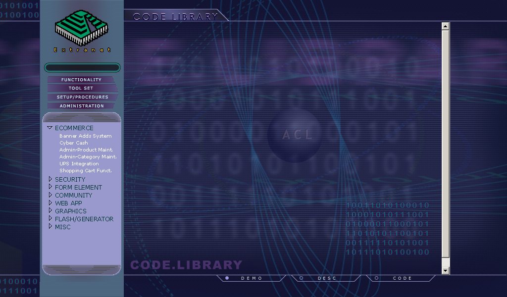
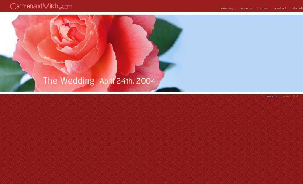
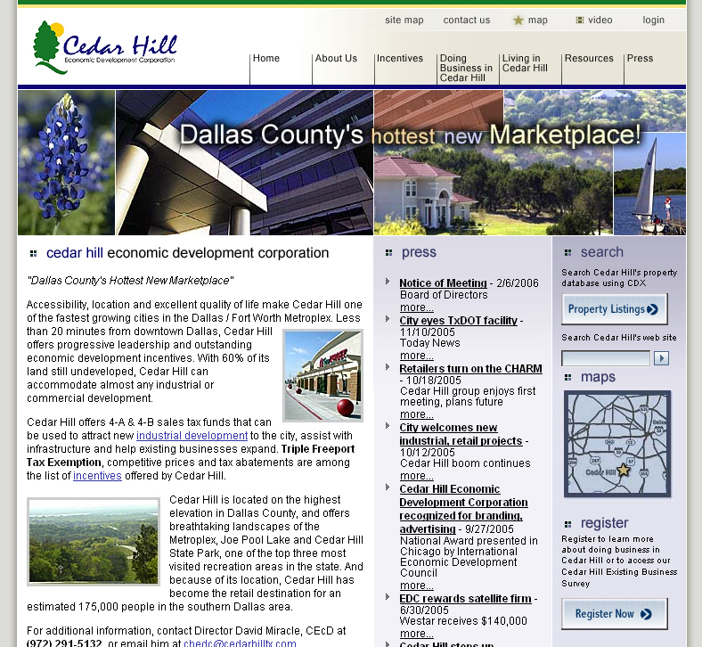
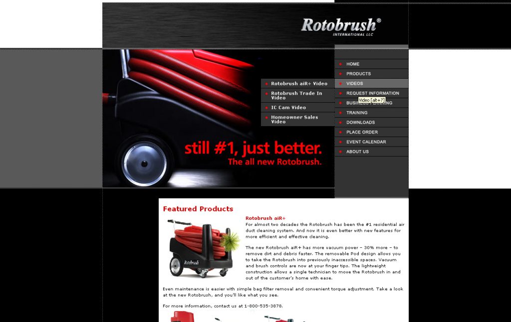
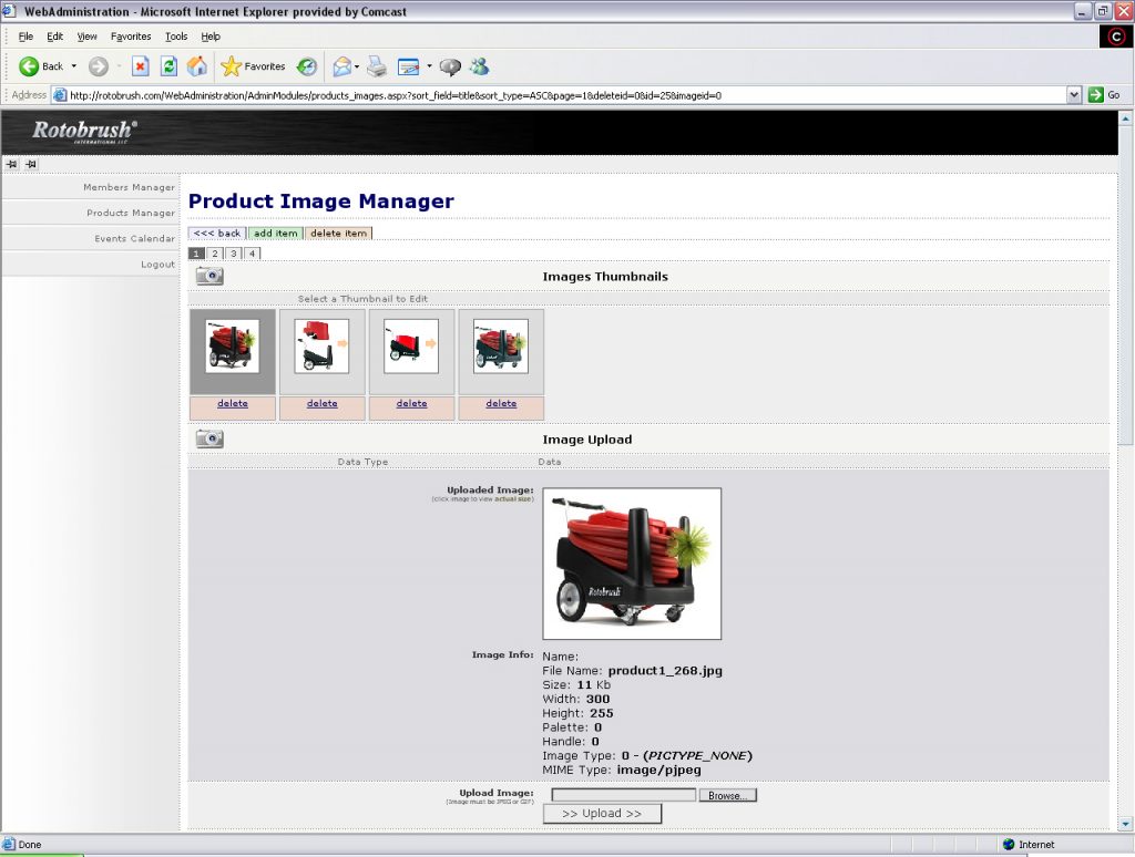
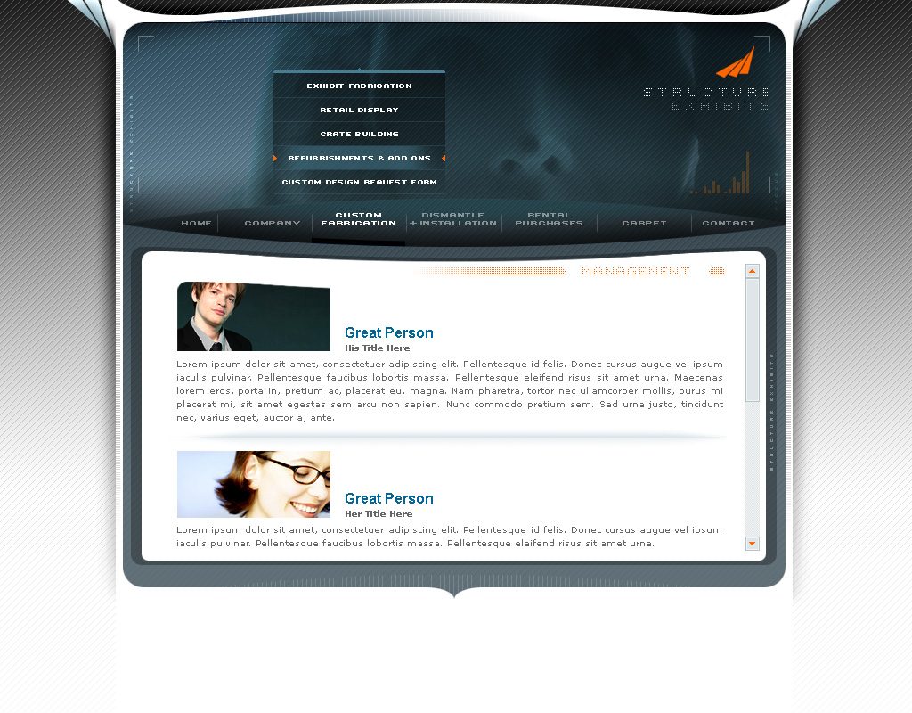
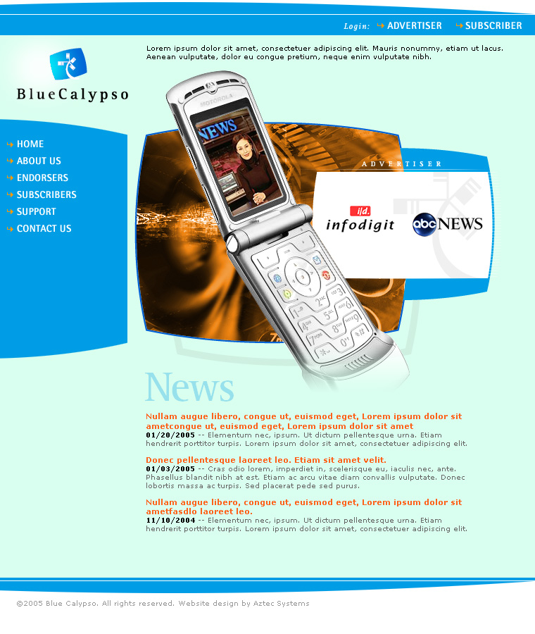
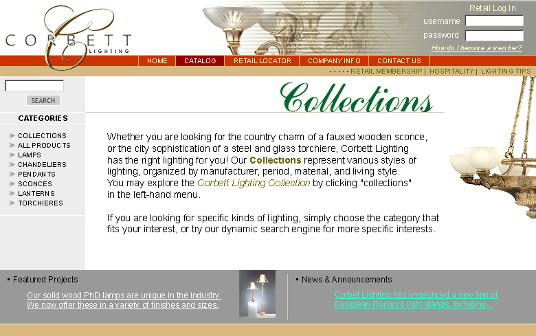
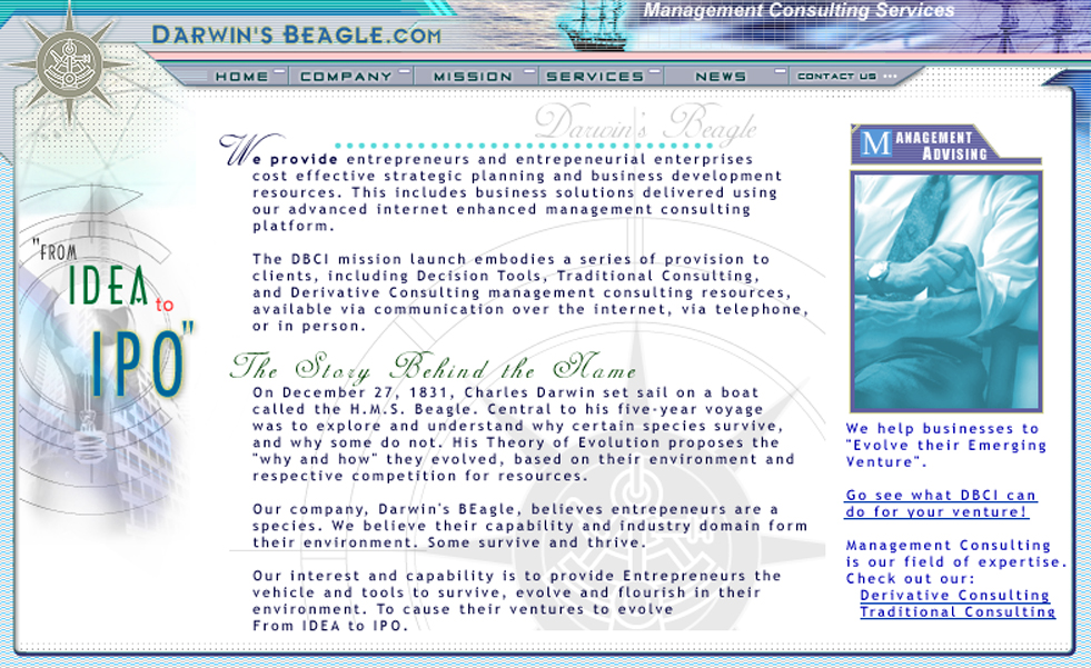
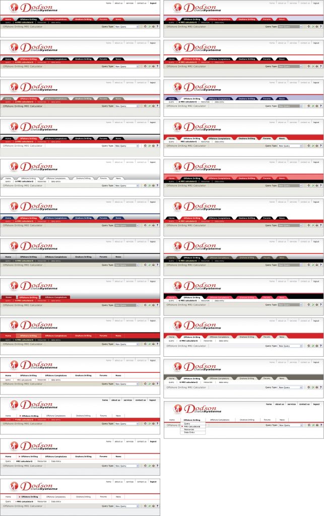
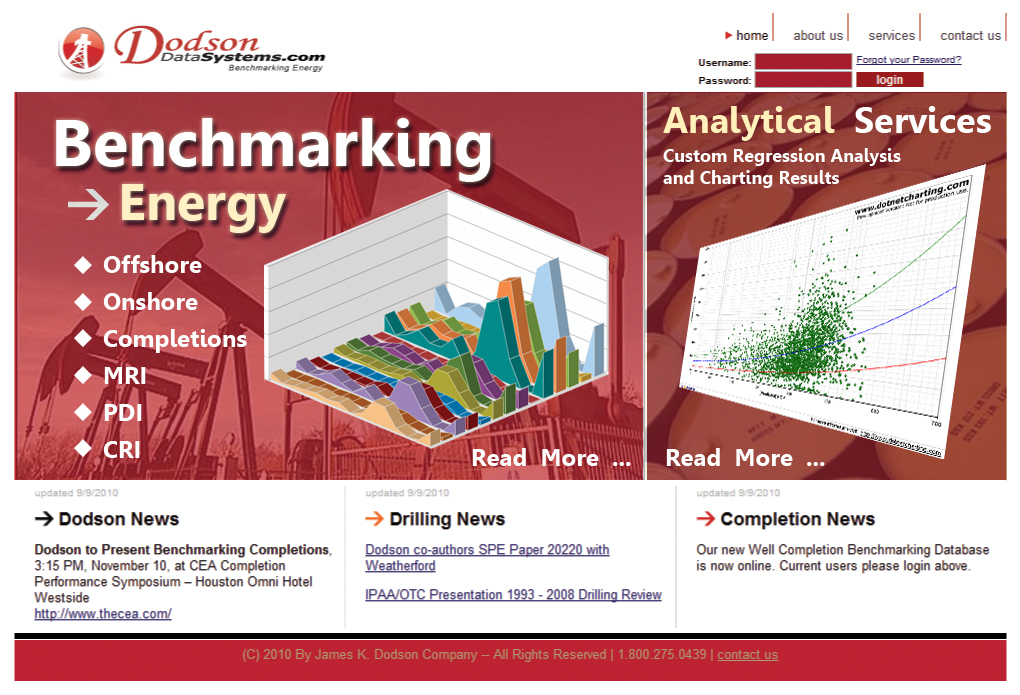
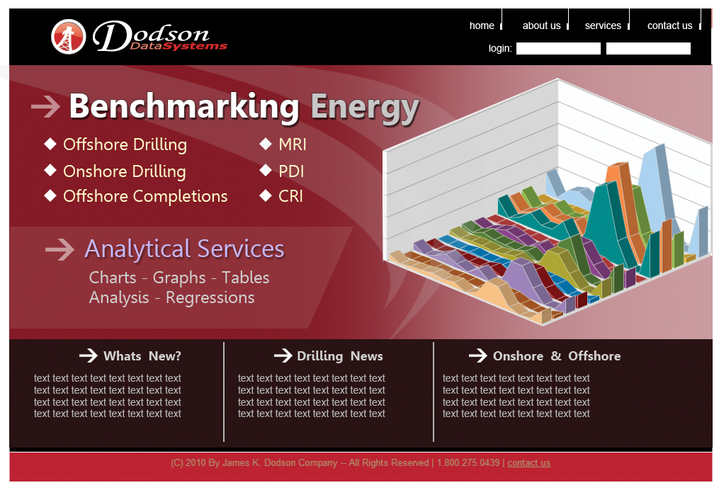
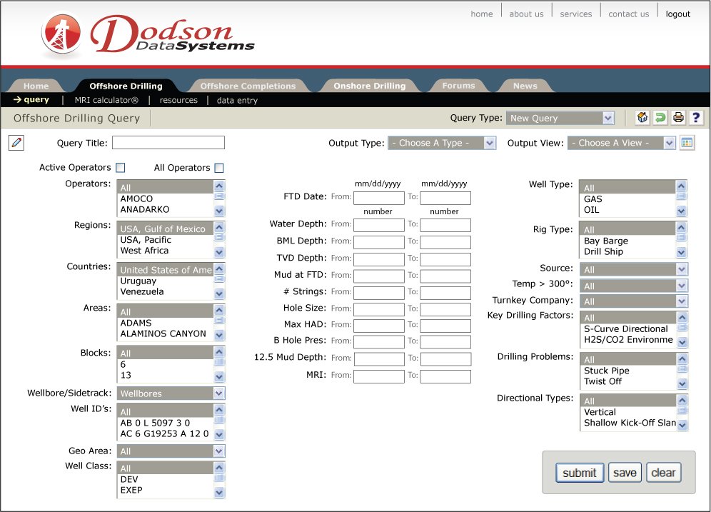
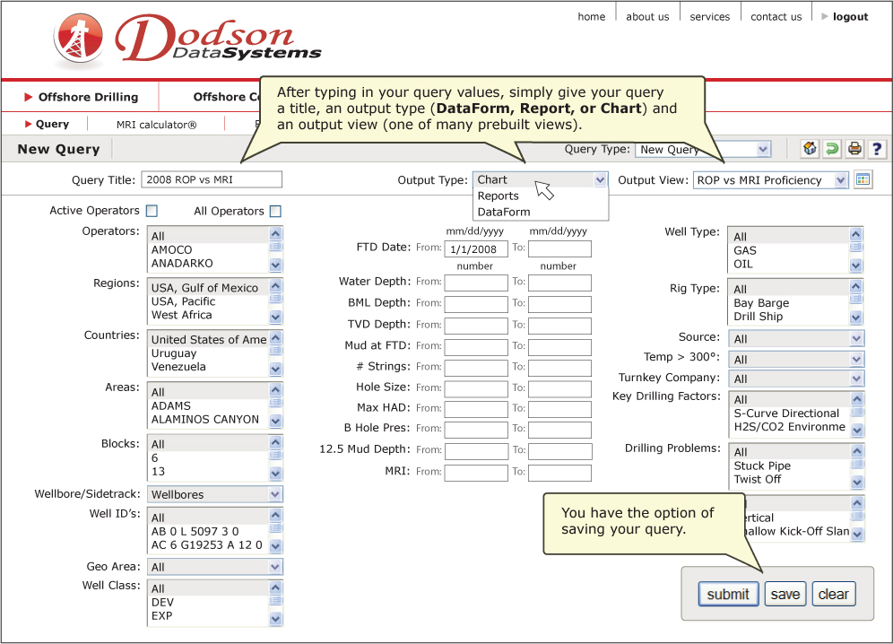
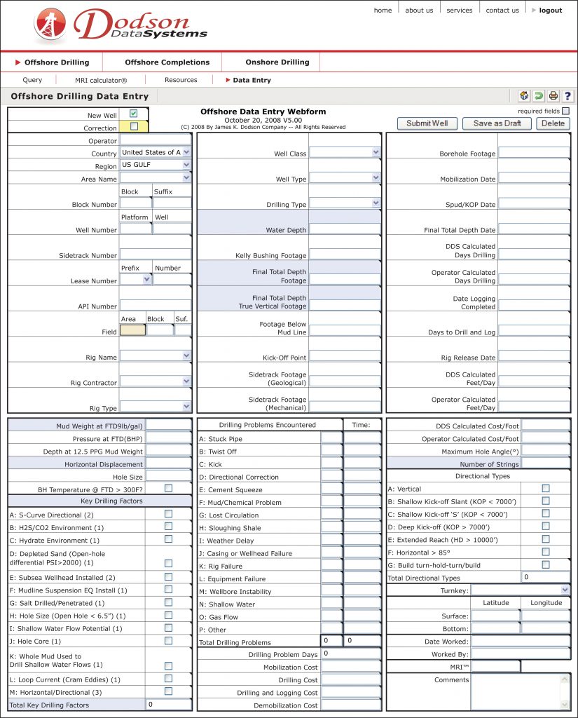
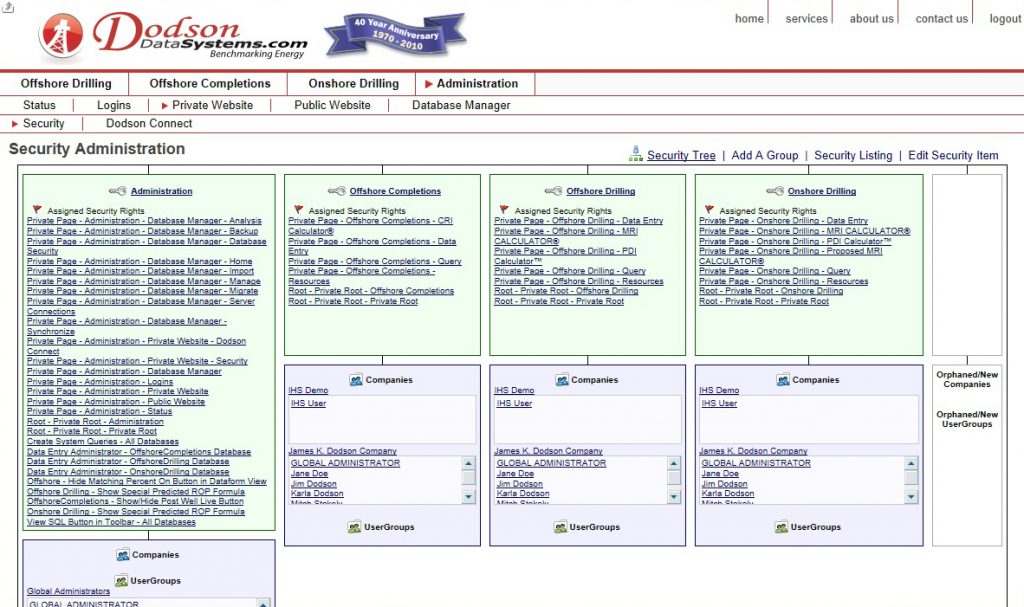
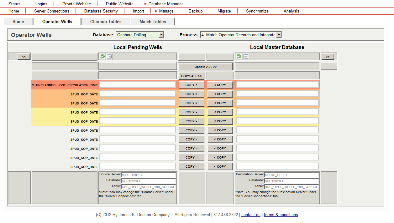
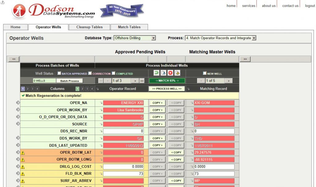
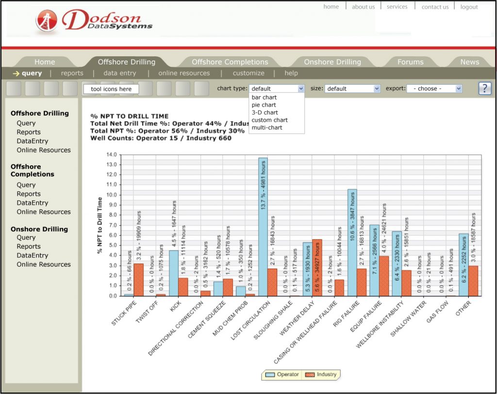
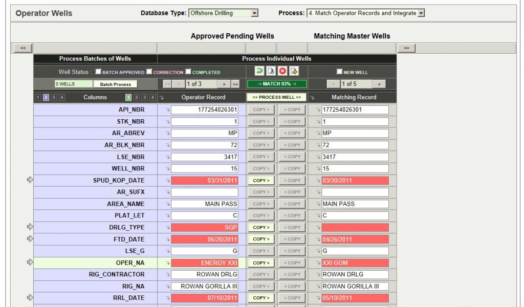
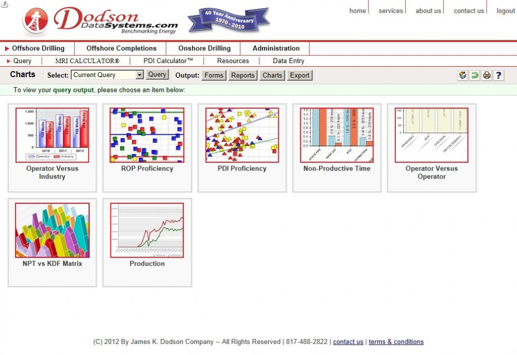
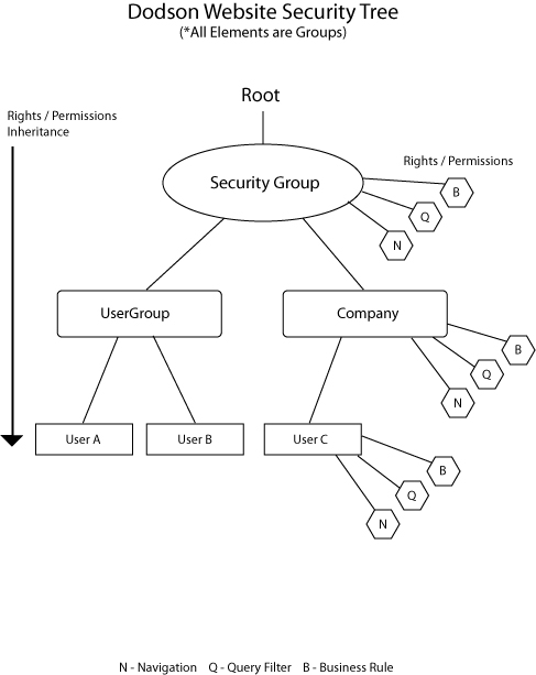
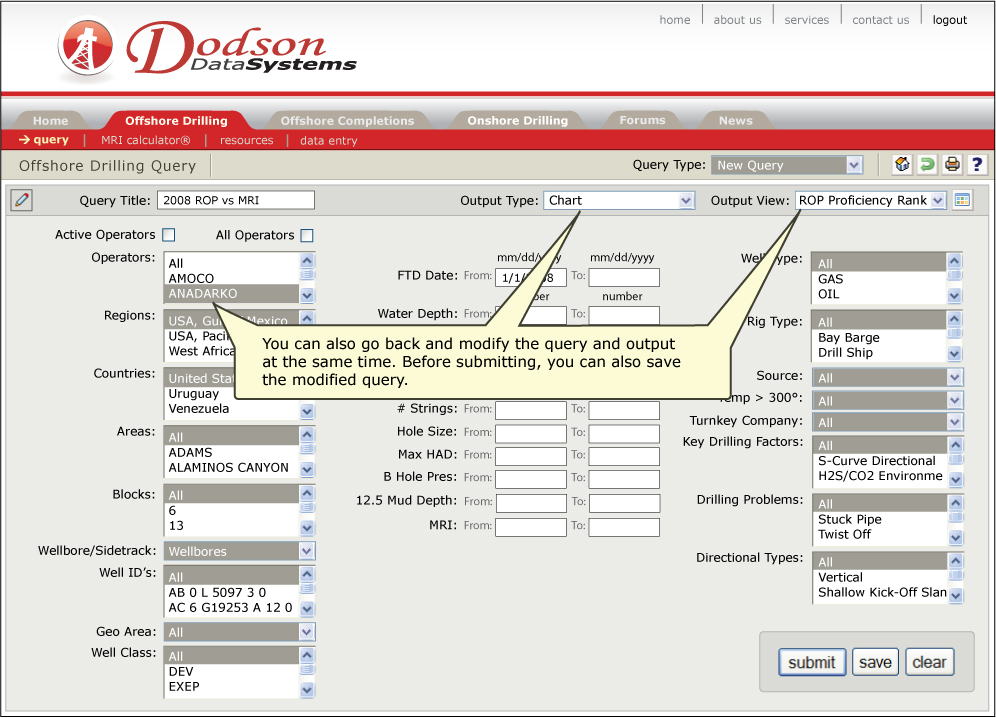
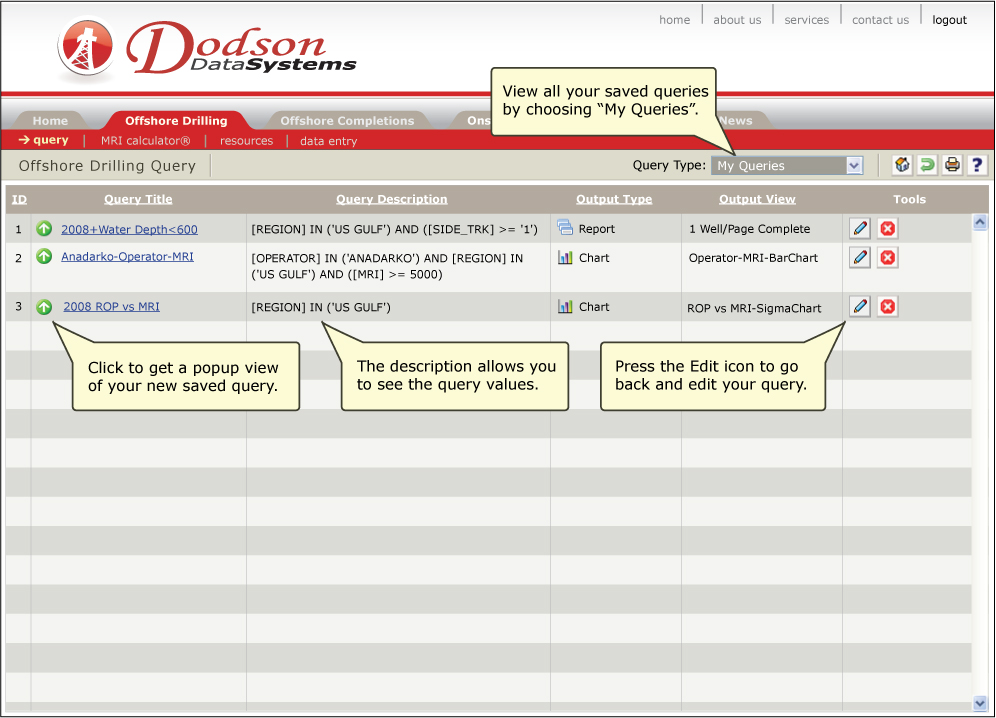
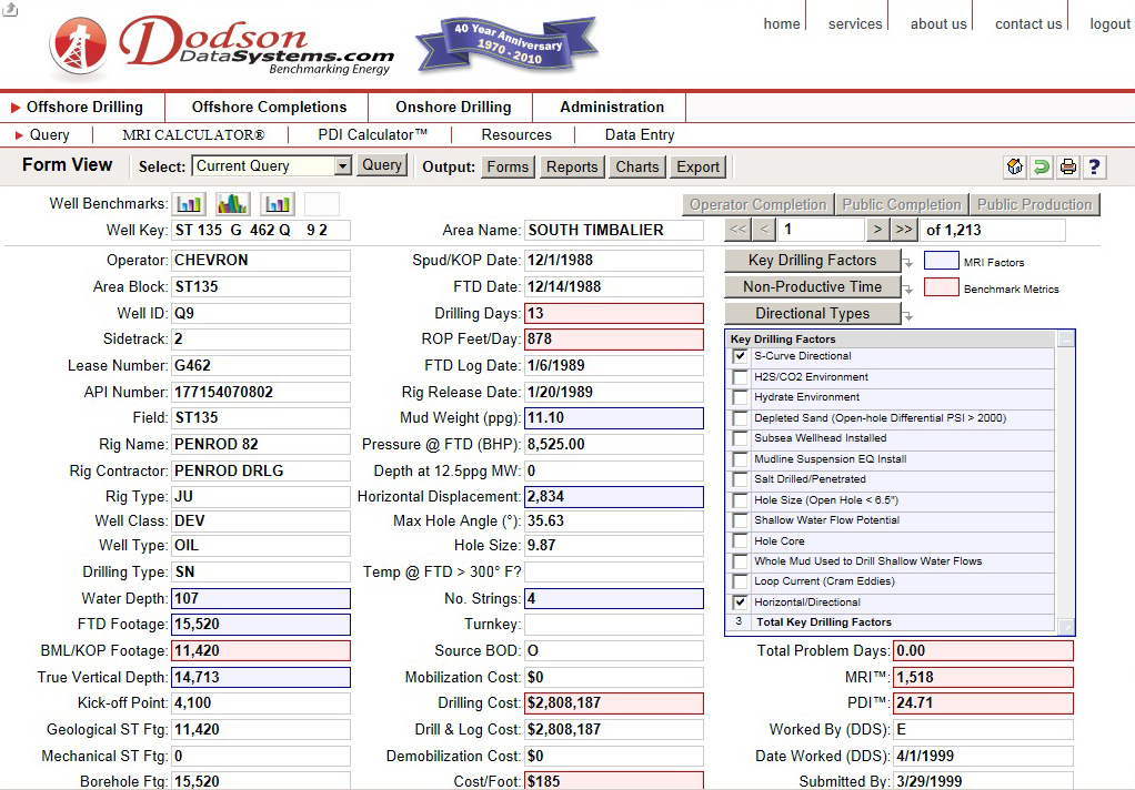
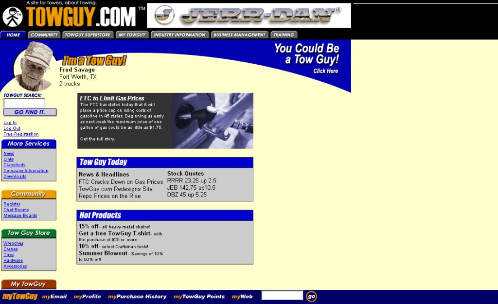
Good web design, or “user interface” (UI) design as they now call it, requires something more than the visual. It requires an understanding of interactivity, of usability, of how information flows, and the emotional response to the complete application. The Internet is about displaying information not art. And any good code or design knows this. For that reason, most of my focus since 2000 has been about maximizing the display and accessibility of information in a simple yet powerful way, learning from projects of the past as I’ve grown and matured as a web developer. All of my examples of interface designs shown below hopefully reflect that goal.
MACROMEDIA FLASH
When I started as web developer in 1999 I was like many immediately drawn to the beauty of Flash. When Macromedia Flash came on the scene it made a HUGE splash online. The HTML-based web was just starting to set down roots in 2000. But Flash was exploding onto the scene as a NEW form of the “interactive web” not yet experienced via Javascript and DHTML.
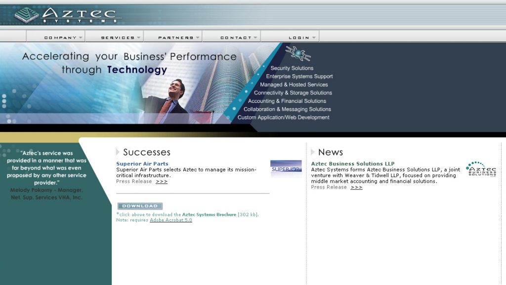
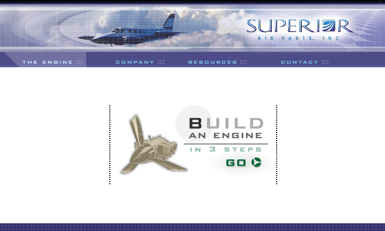
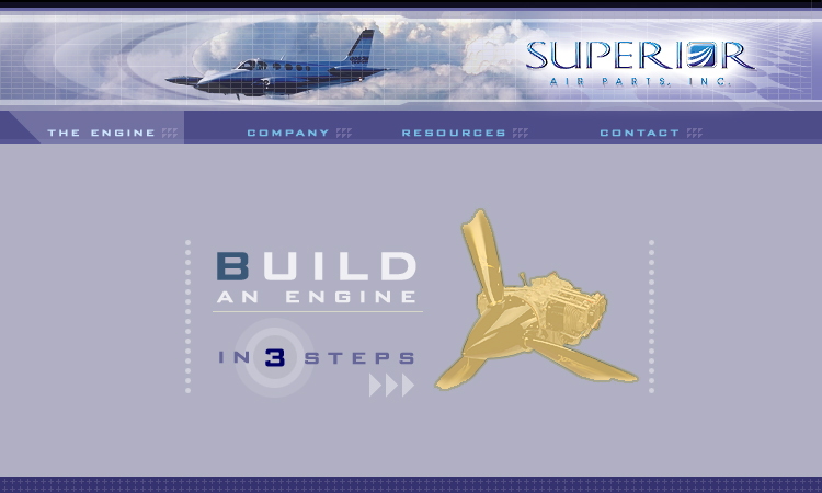
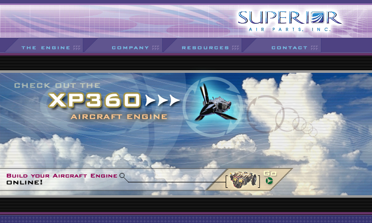
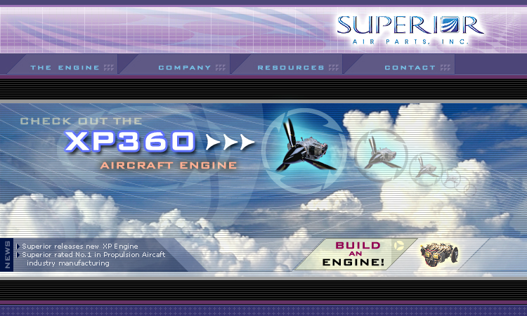
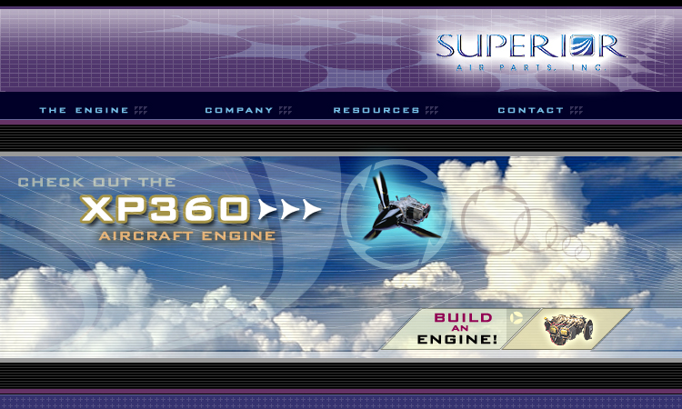
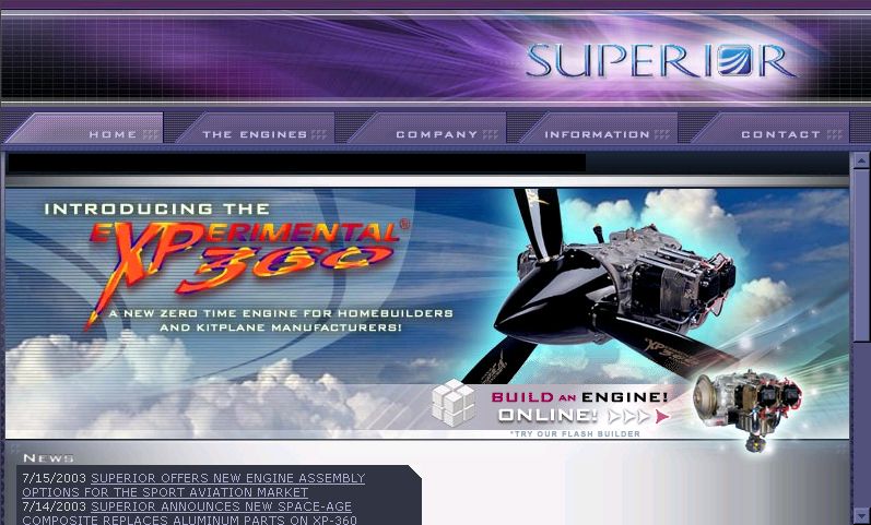
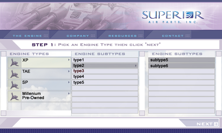
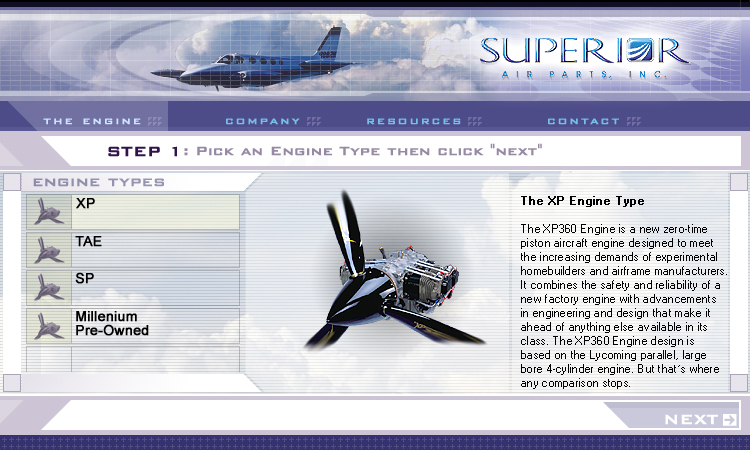
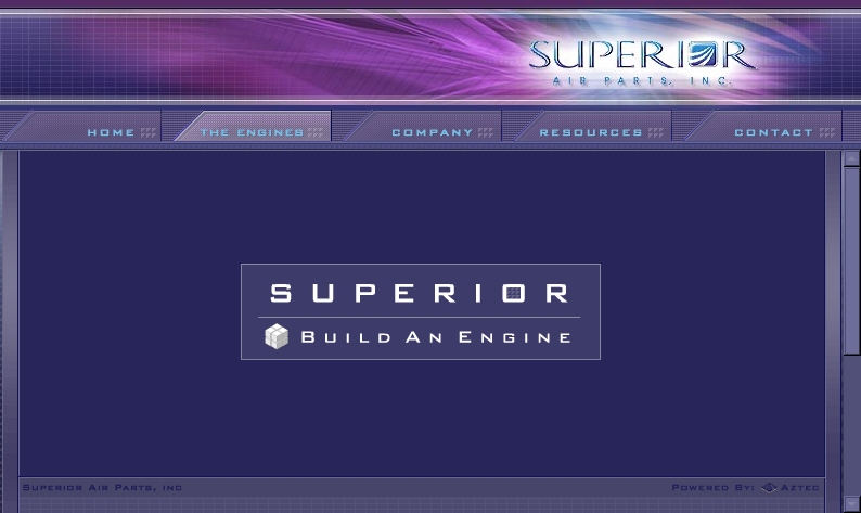
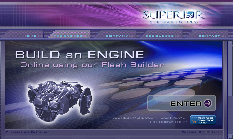
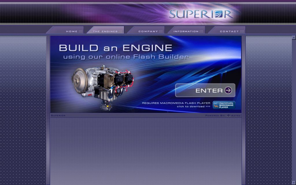
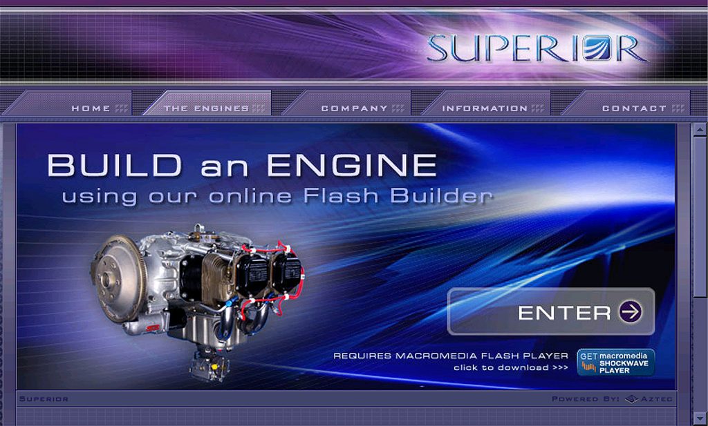
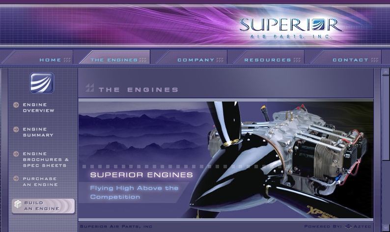
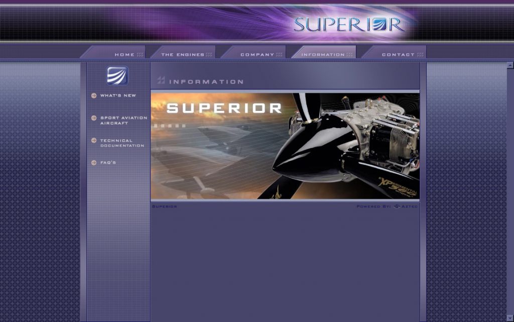
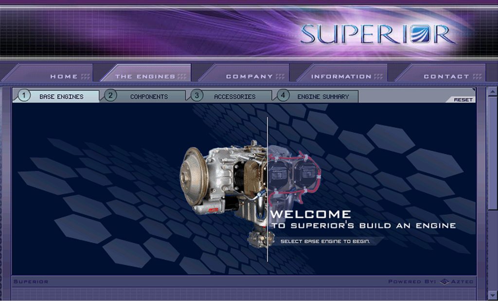
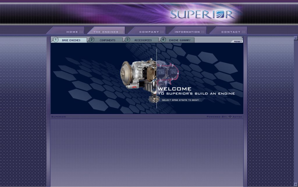
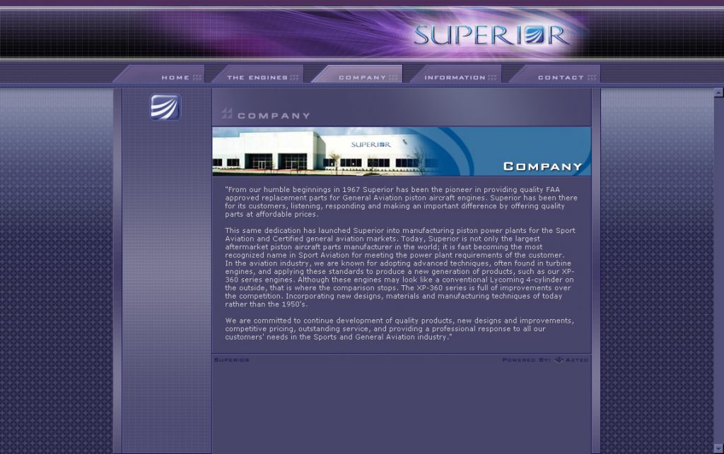
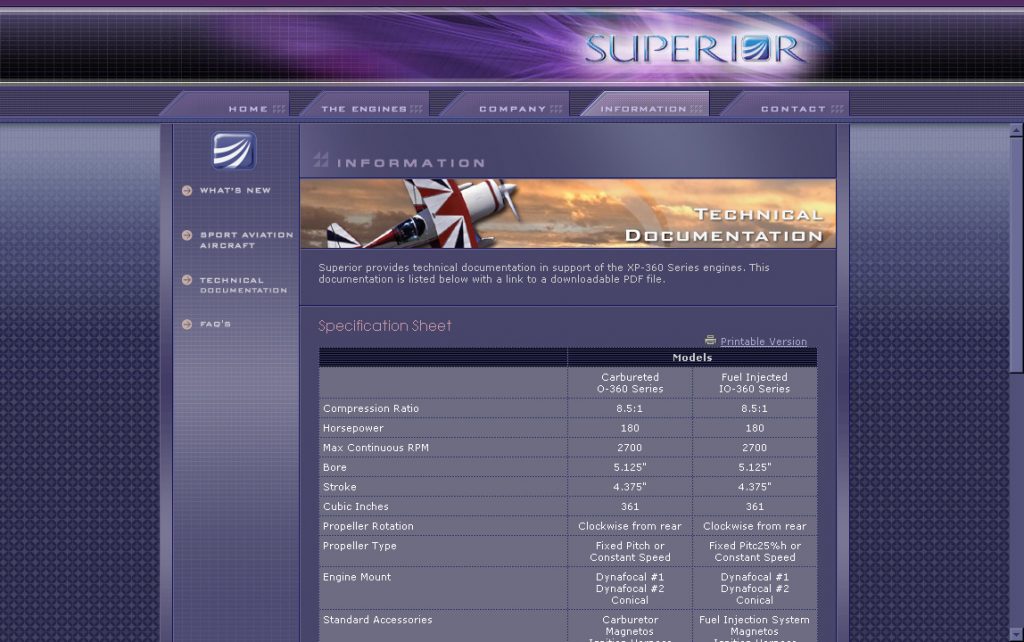
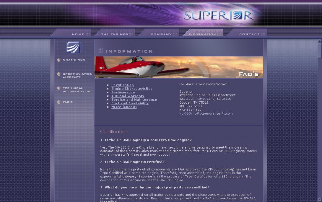
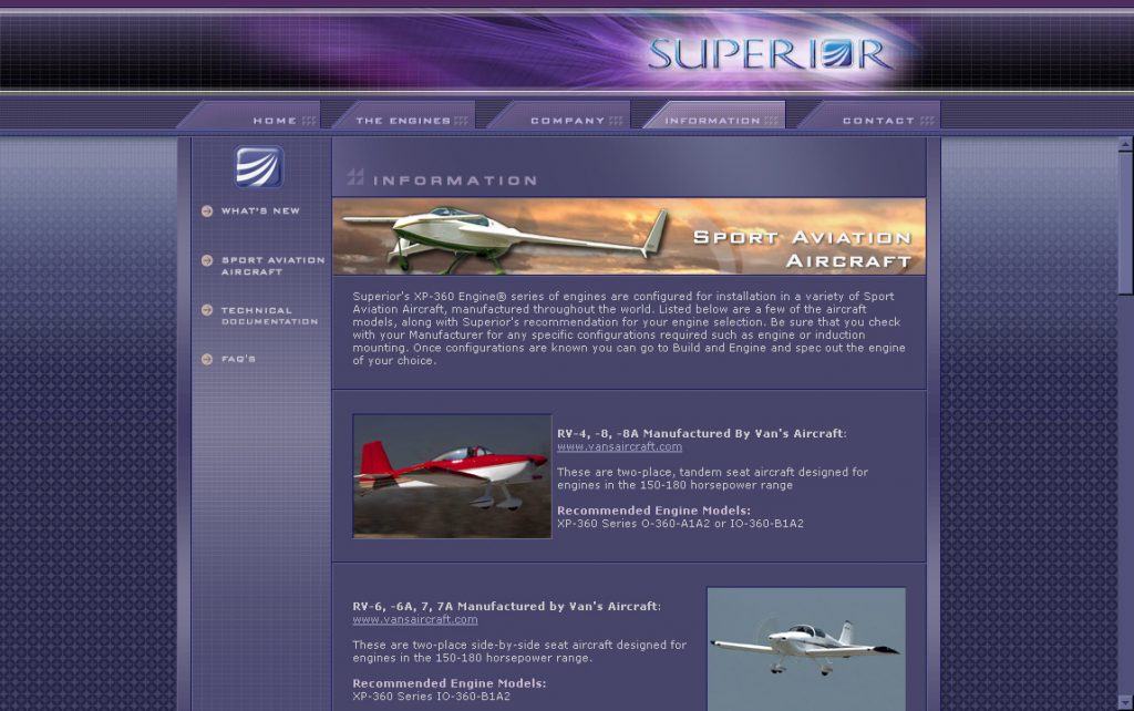
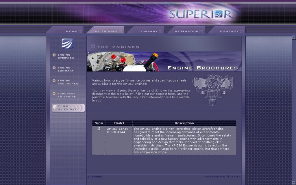
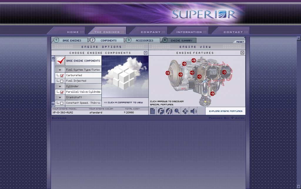
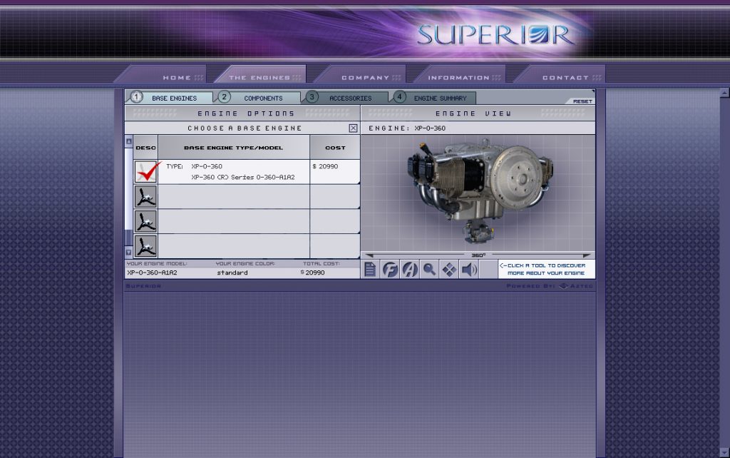
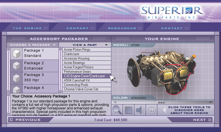
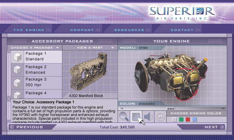
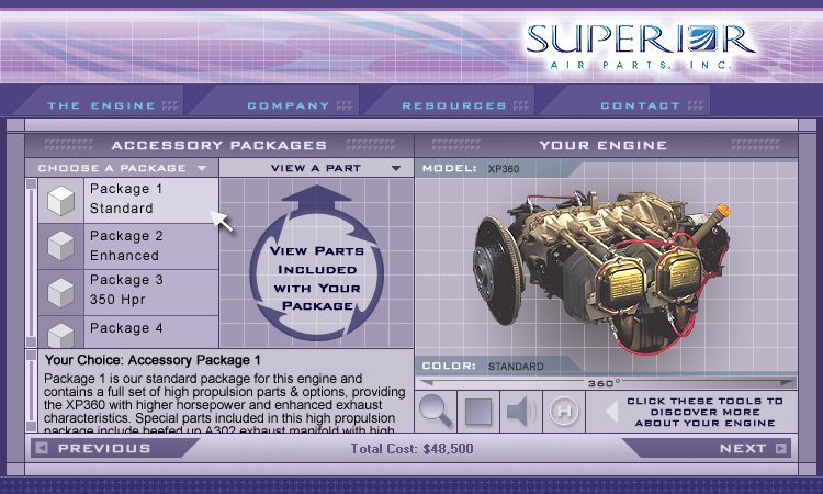
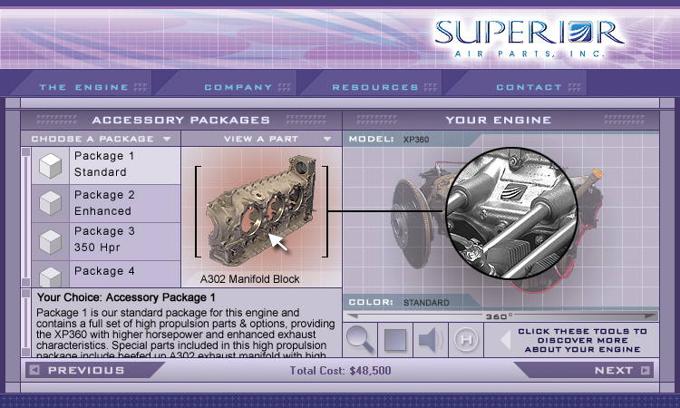
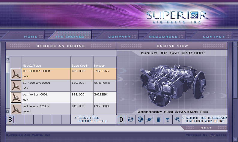
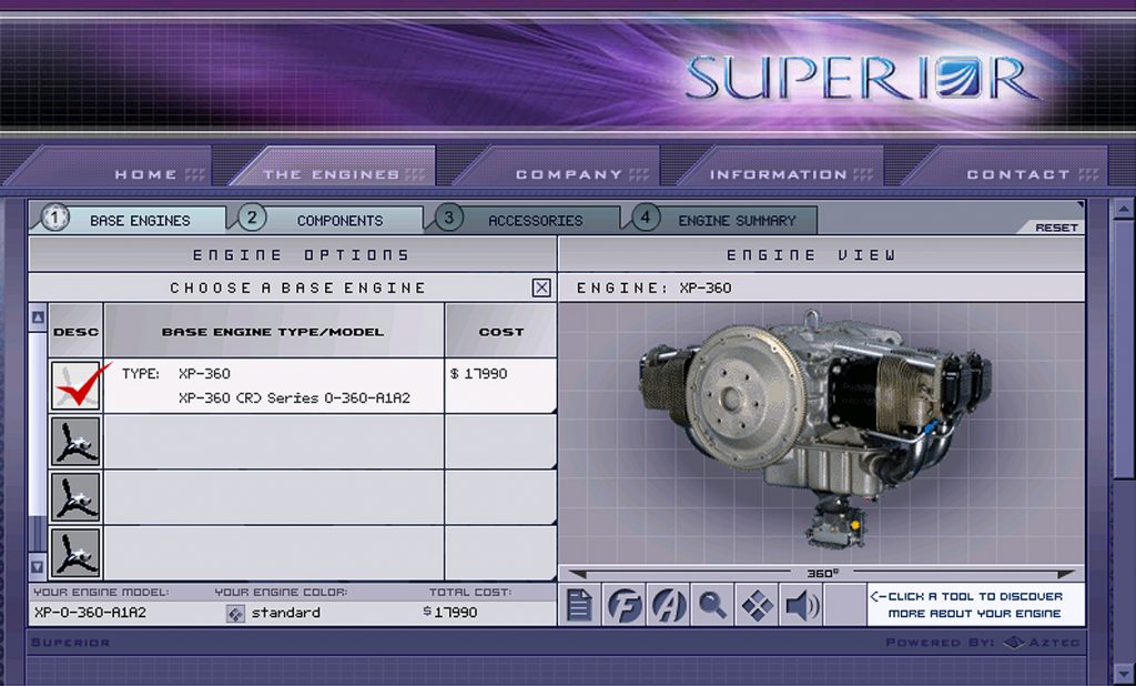
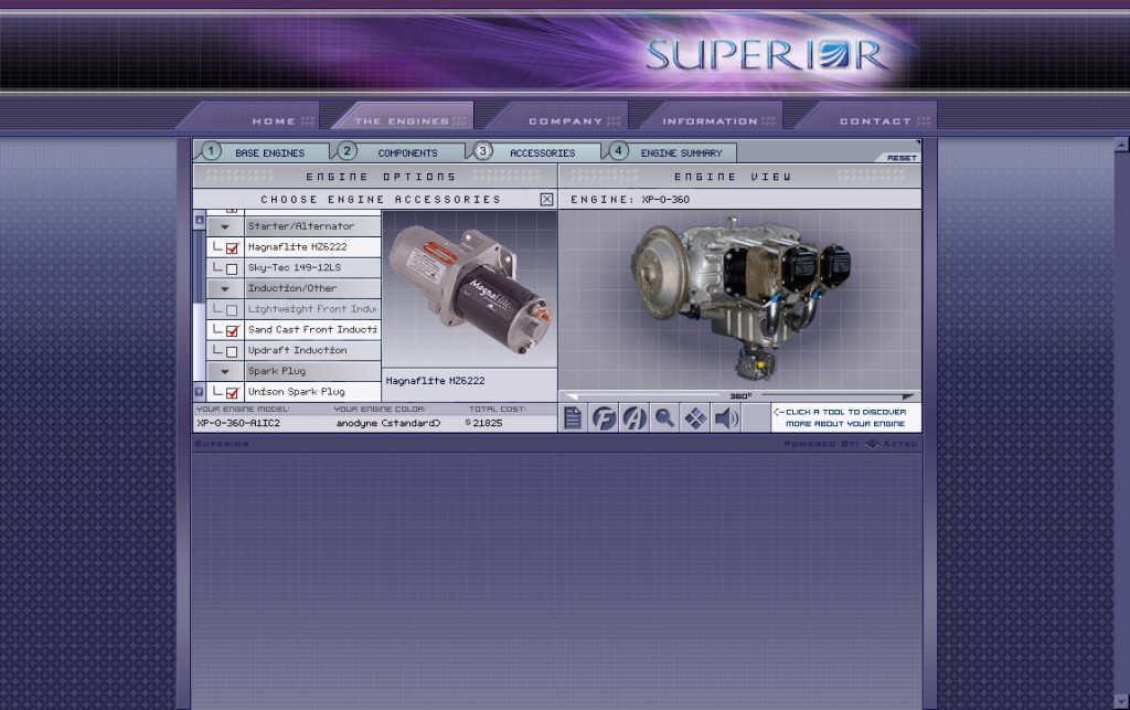
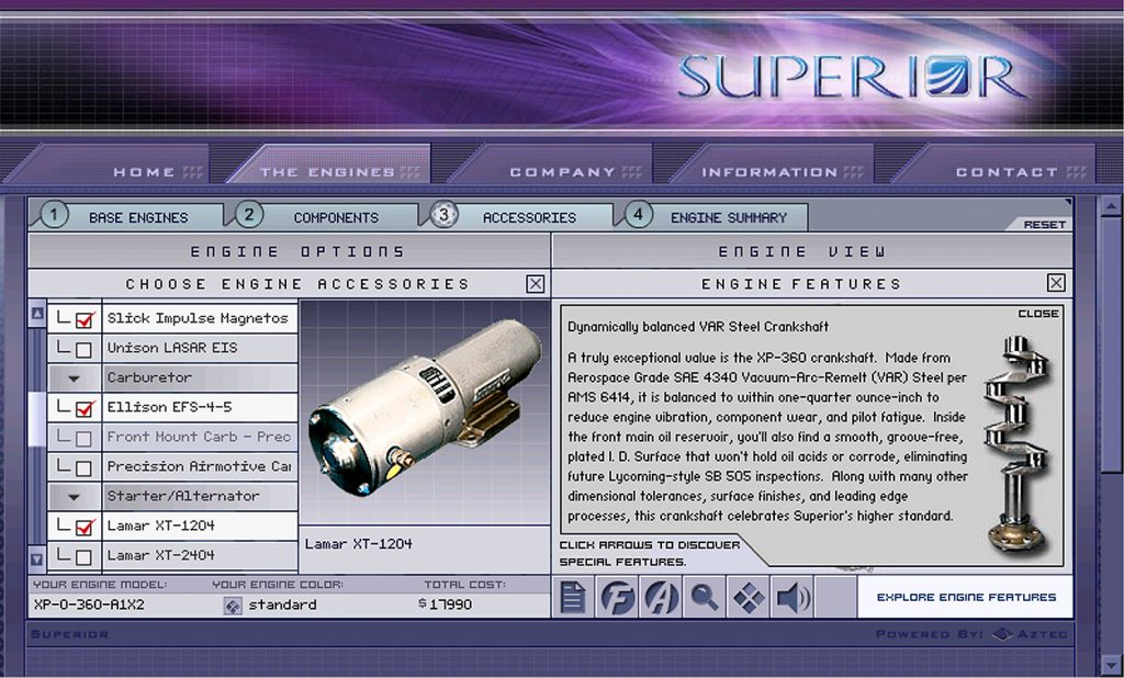
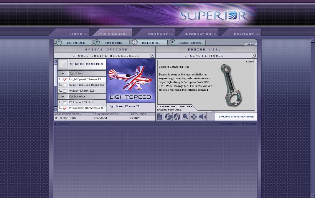
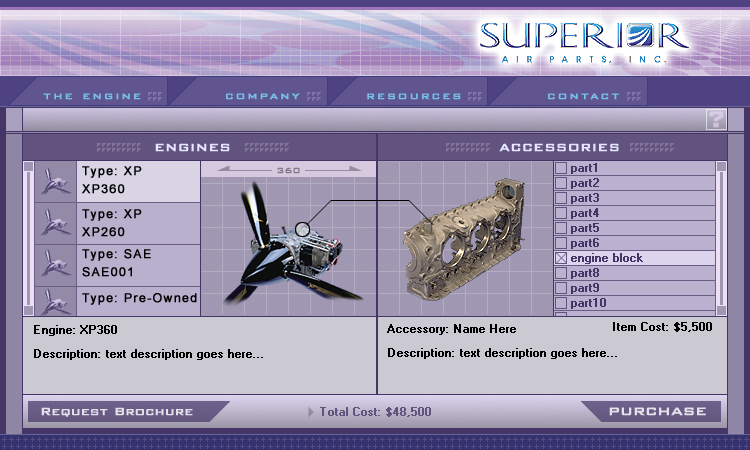
The idea of an animated web appealed to everyone back then with the drive to turn the world Wide Web into something spectacular. Working at Aztec Systems, I pushed all my projects and clients to embrace this new technology. And so I learned Actionscript 2.0 with a vengeance. My first big project, Superior Aircraft XP-360, taught me about the beauty and the intricacy of interactive animated development and the complexity of using XML, scripting, and vector-based symbols management. But it also taught me the limitations of Flash and what the Internet was really about…..which was information. The interface design in that project however was cutting edge design. And it would remain my favorite web project to design and architect years after Flash faded away.
In the years since 2000, we have drifted away from the bold, innovative, cutting edge designs of the early Flash animators. Sadly, Flash lost the Web War in terms of what really exciting web coding and interactivity could have become in the browser. The great promise was there but the usefulness died. Flash like Java applets and many sandboxed systems carried too much security risk and computing power to be viable. We are stuck now with the limitations of a new script problem – JQuery and the Javascripted client-side dependencies in browsers.
Today our mobile devices cannot accept the CPU-hog that is Flash. I had fully embraced HTML and CSS back in 2000 so never lost touch with solid markup practices. But many have. Script kiddies using ECMAScript have now fully embraced custom API’s and client-side scripting instead. But HTML still is king and always will be! But it is worth remembering today that cutting edge web design doesn’t have to mean web design that entertains or awes. Good web design just has to be simple enough to use and convey its information quickly and cleanly, just like plain vanilla HTML5 and markup does today. And so I like so many other animators from that lost era have learned a lot about what solid web UI truly means.
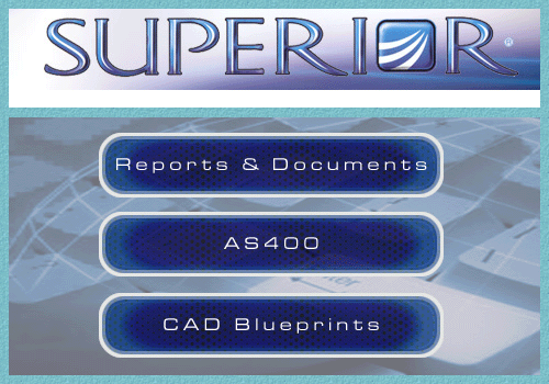
Below are screenshots of the Superior Aircraft Macromedia Flash application. Again, I did the web design, Flash animations, architecture, actionscripting, and XML data integrations that drove the complete front and back-end engine-building systems:
MORE FLASH
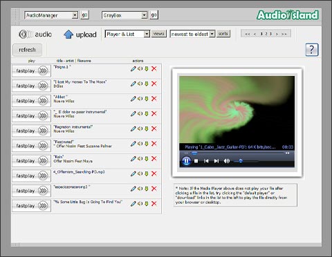
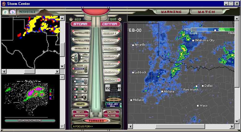
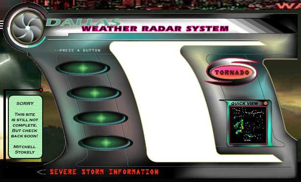
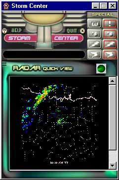
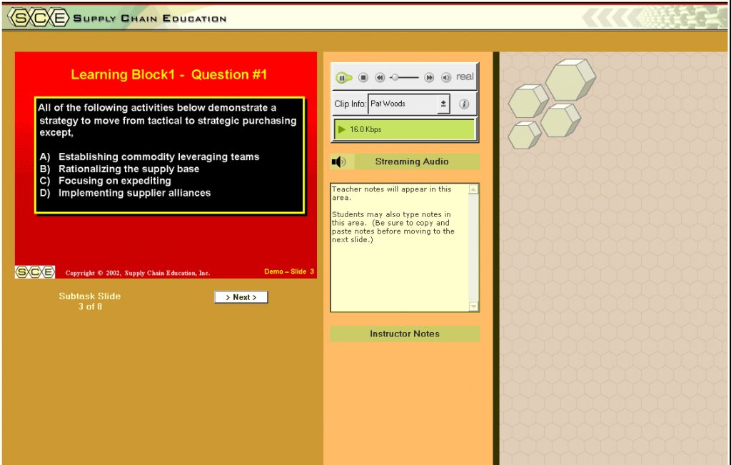
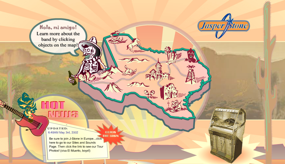
The following are various older Flash Animations I created for websites and businesses in the past. The earliest work below includes a Texas band website, various business animations, and a multimedia demo. Most of my larger Flash-based projects were created prior to 2005 and so are no longer online. I may post more as I’m able to retrieve them, as they are quite creative and reminders to me of the high degree of creativity Flash once possessed.
Jasper Stone – Flash Website (2002)
Multimedia College – Flash Demo (2003)
DIGITAL DESIGN
Like any designer I have done my share of logos and branded designs. These are just a small fraction of logos I have done over the years.

